Tuesday, 31 December 2013

Film Production Notes - Workflow and Techy Stuff

Documents

As I have been creating the assets for my film in Illustrator, I've had to design and follow a workflow that works well with the project I am undertaking. The biggest problem I have been facing over the holiday period was the Illustrator / After Effects dynamic in which files are required to be set up properly and organised in correct folders before importing and animating.

I have created Master files for each document that contains assets. This is so when I create a copy ready to be imported into After Effects, and I notice something that could be improved, I can adjust it in the Master document without it affecting the After Effects document e.g.

The Master Document


The After Effects Copy


Font Trouble

Another aspect I've had tone careful about is the use of royalty free fonts that I have downloaded. When I saved the Illustrator file that contained a font I had downloaded, I got a warning message indicating the font wasn't able to save properly in PDF format (an option I decided to keep on whilst creating the Illustrator files)


To get around this, I changed the type I had created using the fonts I had downloaded into Outlines that are made up of anchor points so they could be saved as objects and not type. (seen as orange dots around the edge of each letter in the word 'Phone' for the Phone_Box asset in my scene)


Effects

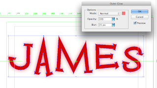
Some assets in my establishing shots required to have certain effects on them to emphasise what they are. The most common effect I've used is the outer glow effect. At the beginning of production, I applied these in Illustrator and then imported them into After Effects, however after testing the document in Ae to see how it looks, I realised I couldnt animate the glow effect since it was locked to the actual object in the layers that made up the assets. To remedy this I've decided to apply the effect in Ae itself instead in Illustrator. 


Applying an Outer Glow effect to the object in Illustrator


When animating an object, the effect applied to it in Illustrator could not be animated along with it

Importing into After Effects

Import as Composition - Retain Layer Sizes NOT Footage! This is so each asset in the ai. document can be separated and animated individually.


Quality - Rasterising 

The reason I chose Illustrator instead of Photoshop to create the assets for my film was because of the crisp look I could get to the objects. Illustrator uses vectors instead of bitmaps which means the assets won't lose quality and look terrible on screen when animating (particularly rescaling). A lot of my shots feature assets that will need to be resized a lot during animation so Illustrator is definitely the way to go. 

Animating


Colour co-ordinating the individual layers really helps in organising and quickly seeing which layer is which

Illustrating the Background - The Sky

To make the background for my establishing shots at the beginning and end of my film, I set up an Illustrator file with a point width of 1280 pt. and height of 8000 pt. I then used the gradient tool to set up the different levels of night sky i.e. really dark blue at the top of the art board through to light blue and finally yellow which represents the light pollution caused from buildings.


I then imported the rough edit of my building backdrop to see how it might look in After Effects when the camera pans down.


I soon realised how large the document was in height so I reduced it down to a more reasonable 5000 pt. and moved the yellow colour on the gradient along in the gradient set up so it fit in better with the buildings.


My next task was to add the other assets into the Sky_Master document such as the moon and clouds.  I put the clouds on separate layers so they could be animated to move left and / or right to create a sense of the weather conditions being a little breezy.

Monday, 30 December 2013

Illustrating the Characters

I have been switching between illustrating the characters and the layout and prop assets over the past few days. I decided to use the same colour palette for the characters I drew in Photoshop. Here is the colour palette I imported into Illustrator from Photoshop for William.


I named each swatch so the colours corresponded to the different parts that make up the characters ie. suit, bow tie, legs etc. so when it comes to creating individual paths for the characters' parts I can easily see which colour is required. 

I also saved the swatch set as an ai. file so I can open it in other Illustrator files later if needed.


Tuesday, 3 December 2013

Friday, 29 November 2013

More Research - New York Manhattan - Street Layout and Directions

To get across my film is set in New York City during the late 50's, I've decided to research the lower Manhattan area more. I went back to my earlier research of New York City and thought more about my layout in conjunction with the geography of the city.

Original camera set up reference - research done during Week 2


I set up the camera reference above facing the subway line I have in my exterior background but after closer inspection of the map, I've found out the camera (as above) would see the buildings in front at an angle because New York City uses a grid-iron road system.


I decided to change the angle of the camera reference so it would fit in with my exterior floor plan I've got going for my film. Using the map, I've decided to set my diner on 9th Avenue, about half way along the dotted blue line in the screenshot above.

Going back to the set up of the exterior assets, I have decided to use the geography research I've done over this term so far and place two street signs in my T-Junction - 10th Avenue, West 57th Street and 9th Avenue, West 51st Street (blue circled above).

10th Ave. 57th St. is on the left of my diner and 9th Ave. 51st St. is on the right of my diner.


I also thought about the surrounding area of my diner, and the kind of shops that might have been in Lower Manhattan during the 1050's. The area was a typical housing and business area which fits my film location well since I have apartment buildings in the fore and mid ground of my scene as well as some shop exteriors, namely a barbers, car wash and market store.

Another piece of interesting visual research I found was a collection of video clips that were recorded during 1950's New York 

1950's New York City video recording

Exterior Scene Asset Redesigns

Before I began creating the actual assets for my film, I took a look through the designs for the assets in my exterior scene I did a few weeks back as well as the After Effects 3D scene test I did on Tuesday and decided that they weren't interesting enough to look at. I also knew that if I illustrated the rest of my assets in a similar simple design, my 3D scene won't look rich or vibrant like it should be. They also didn't have much detail but definitely had the zany style I am going for in my film. Here are the exterior assets I redesigned.


References


Thursday, 28 November 2013

After Effects 3D Scene Set Up Practice

I've been practicing illustrating various assets for my exterior scene and importing them into After Effects to create a 3D scene that I can bring in cameras and animate certain shots for example the establishing shot which is a pan and track in.


I put each part of the apartment building on separate layers before going into After Effects. I made sure to "Release to Layers (Sequence)" before I went into After Effects and imported the ai. file. This is so the layers appear in After Effects as they do in Illustrator. 

I parented the different parts of the building to the main building shape so when I moved that particular piece to set it up in 3D space, everything parented to it would move with it too in all directions. 

Concept Art - The Party


For this particular piece I wanted to get across the feeling of joy and celebration in the diner. This shot is the beginning shot of the final scene and the resolution of the story which is the emotional high point of the story. By using strong bright contrasting colours for this scene, I think I've got across the impression of a party scene happening. 

Parties host many types of people getting together so I expanded on this thought and designed two sets of characters which are seen in the group of people in the middle of the frame. The middle two are the fun types who are enjoying themselves and the two on either side are the ones who aren't enjoying the party. 

Tuesday, 26 November 2013

Maya Neon Sign Practice

Although I am now doing a full 2D film, I am still considering incorporating some CG elements into it. I am also going to develop these elements in my own time too.

Yesterday when walking home from the studio I noticed how bright and kind of magical the neon lights appeared on the Ritz Wetherspoons located on the High Street. The quite bitter temperature in Lincoln that evening seemed to make the lights more apparent and welcoming than usual, in my opinion. I took a photo on my phone to see how the colours and overall looks of the neon lights looked through a camera lens.


I also noticed how the light emitted from the neon lights fell on the ground and surrounding brick work on the building. I like how they highlighted the details on the bricks including the outlines of the shape of the building. This is something I'll have to think about when constructing my scene in After Effects. 

----------------------------------------------------------------------

Today I've been trying neon signs that represent objects using actual geometry instead of applying shaders to text like I did last week.

I decided to take one of the car design sketches I did over the weekend and make a 2D neon sign out of it.


Next I took this into Maya as an image plane and started making the geometry using the CV curve tool. I then edited the resulting shape by moving the Control Vertex's to line up with the image plane better.


Some parts of the sign are closed circuits so I had to select both the first and last point and turn on Snap to Points and then go to Edit -> Open/Close Curves to close the loops so when it came to extruding the curve using a NURBS Circle, there wouldn't be any gaps in the geometry created from the open CV curve.


Next I deleted the image plane, since I didn't need it anymore and began extruding the curve out to create geometry. To do this I had to select the NURBS Circle and then shift select a piece of curve. I then went to Surfaces -> Extrude settings and set the extrusion settings to "At path" for Result Position and "Component" at Pivot.


I then repeated this for each piece of curve. 


I noticed some imperfections in the geometry formed so I had to go back to the curve and make sure the path was closed.


Now that all the curves had been double checked for imperfections, I could reduce the thickness of the geometry by scaling down the NURBS Circle I used to extrude from.


I then had to scale down some pieces of the car so they didn't intersect the other pieces of geometry close to it. To do this I had to centre the pivot first. I also had to select a section of some Control Vertex's and scale and/or move them slightly to get as much a perfect shape of each piece of geometry so the whole car looked good.


Now that the geometry was completed, I could start setting up the neon shaders. To do this I used the Hypershader and made three Lamberts and named them "red", "white" and 'blue".

Incandescence

really bright red hue - 'glow' colour


Colour

lighter red - main colour of the shader


Increase Glow Intensity under Special Effects to around 0.15 to start with


Repeat for the other two lambert shaders


Finally I applied the shaders to the parts of the car and took a test render

?

The blue appeared darker than it should have so I went back to the shader and changed the incandescence of the "blue" Lambert to a lighter hue of blue.


I then took a Production Quality render using Mental Ray since that is what I might be using to render none signs out in the future.


After looking at the geometry closely I discovered more imperfections so I went back in and sorted them out. I didn't delete the NURBS curves behind the geometry so I could go back and edit them too.