Captain Pugwash
The classic Captain Pugwash saw John Ryan's character come to life in a simple yet very effective animation style. The characters' body parts were created as individual pieces of thin cardboard and filmed like stop motion. The characters were essentially puppets and the limited animation and snappy movements gave Captain Pugwash its unmistakable look.
Fig. 1. Captain Pugwash 'Down the Hatch'
Peppa Pig
A more recent example of cut out animation in children's TV shows is the hugely popular Peppa Pig created by Astley Baker Davies Ltd. The animation and all the assets such as the characters and layouts are created and animated in a program called CelAction which was developed especially for the studio.
Fig. 2. Peppa Pig 'Edmond Elephant's Birthday'
Fig. 3. Example showreel of a 2D rigging artist and animator using Cel Action
Here is the link to the CelAction Website
Other examples of 2D puppet character animation softwares
I have been researching other programs that have been specifically created to do 2D puppet character animation. Below are two examples I have looked at and are interested in looking into further.
Tab 3.2 Software Website
Anime Studio Website
LAYOUTS
I also showed Hilary the updates I have done with the layouts and one of the things she commented on was how although the progress of the layouts looks good and the level of detail is just enough that it's clear we're in a diner, the colours are too contrasting with each other, and although not too noticeable or unappealing so far, if I don't change the layout colour palette, the film will be very harsh to look at on the big screen, especially because my film has a lot of quick cuts, the changes between the colours will be annoying and put a lot of people off my film. Hilary suggested I tone down the backgrounds so there is a less wider range of colours (especially the black vs. white floor below). I have changed the black to a dark grey, so it still reads as a grid floor which is fairly common in diner interiors and is now less harsh to look at. I asked Hilary whether applying hints of textures and grain effects to large areas of colour will help tone down the harshness of the layouts which she said would work well too.
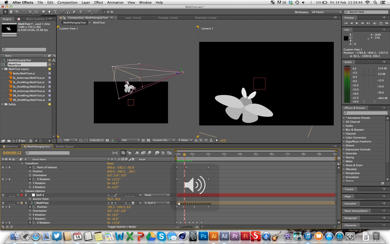
Here is the moth we see escape from William's wallet in shots 46 and 47.
Fig. 6. MothTest.ai file (WIP)
Fig. 7. Moth asset in After Effects in 3D space
Hilary commented on how the moth appeared too dainty and won't really be noticeable (ignoring the assets in grey scale) against a bright background that pans up to follow the moth.
CLOCK ASSETS & ANIMATION
The clock asset is seen a lot in my film so the design needs to be really simple as not to confuse the audience what it is. When I showed Hilary the WIP clock animation, she said the minute hand didn't look like a minute hand due to the snake like appearance of it when animated. To fix this and achieve a simple yet realistic look to the minute hand, I deleted the puppet pins I applied and animated to get the stretchy quality and adjusted the keyframes of the minute hand.
(insert screenshots of keyframes before and after)
Fig. 9. Clock asset ai. file
Fig. 10. Clock animation WIP
Fig. 11. Clock animation FINAL
Fig. 1. Video Link https://www.youtube.com/watch?v=Rj70NtJgLik [Accessed 18/02/2014]
Fig. 2. Video Link https://www.youtube.com/watch?v=vqABuCixPNM [Accessed 18/02/2014]
Fig. 3. Video Link https://www.youtube.com/watch?v=Ph_Hi1td0uE [Accessed 18/02/2014]
Fig. 2. Video Link https://www.youtube.com/watch?v=vqABuCixPNM [Accessed 18/02/2014]
Fig. 3. Video Link https://www.youtube.com/watch?v=Ph_Hi1td0uE [Accessed 18/02/2014]


No comments:
Post a Comment