Wednesday 19 March 2014

Layout Trouble - Back To The Drawing Board

Today I spoke to Sultan following the formative review two weeks ago about the progress I am making. Since the formative review I have ben taking the advice that was said about the layouts not working and trying out the changes that were mentioned. This included multi planing, camera depth of field, applying a vignette effect and blurs to the frame, adding shadows to assets to add depth as well as textures, gradients and textured brush strokes to the outline of some of the assets depending on the shot i.e. how close they are to the camera (assets further away don't need them)

Here is one of the layouts in Illustrator 


Fig. 1. WilliamDoor layout


Fig. 2. WilliamDoor layout with lighting information


File in After Effects 


When I showed Sultan this layout in After Effects, he immediately said there was no clarity between the foreground and background assets as well as no lighting information. He also commented on how the door is the most clear asset to understand, so I have decided to use the style I achieved for this throughout the rest of the layouts.


Whilst researching job opportunities and similarly designed projects in the animation industry at the moment, I came across 'Into the Animation Factory', a sequel to 'The Story of Animation' by director David Tart and Tumblehead Studios in Denmark.


After watching their video, I have noticed they have created the impression of the layouts existing in 3D space by just using:

a strict colour palette 
mixed opacities 
blurred background assets and defined foreground assets to frame the shot better and direct the audiences' eyes towards the point of interest

Asset Tests


Layout Test


I think this approach works well and is an improvement from the earlier versions of the layouts.

Saturday 15 March 2014

After Effects Animation - Keyframe Interpolation and Keyframe Types Research

To improve the quality of animation, although a limited medium, After Effects animation can be improved by employing methods for reducing the amount of keys needed to be set and therefore create better animation.

I found a useful tutorial which I used as a basis for this research:

Guide to Keyframes in After Effects

I am going to finish blocking the whole film, then go into the keyframes for each shot and edit them to different types to keyframes to achieve better animation. I will check the graph of a layers’ transform properties by clicking on the graph editor and going to 'choose graph type and on the options’ pop up menu, make sure ‘edit speed graph’ is turned on. This is to check the spacing between each frame in the timeline in an easier to understand format. 

To change a keyframe type, I right click on keyframe and go to keyframe assistant and then select easy ease, easy ease in or ease ease out. These are to improve the spacing. I can also grab the keyframe handles like the pen tool and edit spacing that way.

The dots seen along a path created between two keyframes represents the frames in-between the keyframes in the timeline. There are two types of key framing; temporal and spacing.

TEMPORAL KEYFRAMING

Linear

constant speed - straight line (the number says how many pixels per second)

Ease In

increasing arc favouring starting position key

Ease Out

increasing art favouring end position key

Ease In and Ease Out

even arc favouring neither position keys

Jump and Slide 

snappy look

Heavy Ease

similar to ease in and ease out - pull keyframe handles in towards middle


Hold 

two keyframes with no ‘inbetweens’ - snap between each value


Fig. 1. Tutorial File - 'Keyframe Time' comp - for timing of the animations


SPACIAL KEY FRAMING

Adjust keyframe handles to create arcs 


Fig. 2. Tutorial File - 'Keyframe Position' comp - for spacing of the animations 

'Black Dog' Water Ripple Effect for Kelly Brookes - Research

Fellow third year student Kelly Brookes approached me a couple of weeks ago asking if I could produce the water ripple effect for one of the shots in her film "Black Dog". The shot in question is where the main character is drawing the wildlife at the local park and features a swan floating on the water. 

To start off with, I've been researching how to go about doing an effect that will both fit in with the style of her Flash animation and compliment the look of the film.


Fig. 1. Screenshot of Flash with Kelly's blocked out animation

I also asked her what kind of water effect she wanted. I also asked mostly about the weather in the shot and where the shot actually takes place. Kelly told me the weather is both sunny with a very calm wind and that it takes place at a park. 

For primary research I found reference videos online and last week took a visit to the local quay to see how water moves when the weather is calm and how it reacts to the sun i.e. the reflections and swans floating on top.


Fig. 2. Water effect reference online

PROPOSED METHOD ONE

The shiny plate effect I created for Shot 28 in my film (Betty POV of William's plate after he scoffed his first meal), can be applied to the water ripple effect. This technique of masking out the 'shiny' layer with the different layers of water ripples cut out from the PSD water background Kelly gave me should work ok but I will see what Kelly thinks as I progress through this.


Fig. 3. Shot 28 shiny plate effect test 

PROPOSED METHOD TWO

Whilst researching other methods of creating 2D water ripple effects, I came across this tutorial on using After Effect's built in FreeForm effect to create a ribbon floating in 3D space. Although the techniques covered produce a 3D animation, I can use the tool and other techniques I've learnt throughout the year to create a slightly more realistic effect for Kelly's film.


Fig. 4. FreeForm effect tutorial 

Monday 10 March 2014

Layout / Character Improvement Suggestions - Research and Tests

Over the weekend I have been researching the suggestions that were made in my formative review on improving the layout / character aesthetic in my film. Below is the research I did and the tests I have done for them.

CAMERA DEPTH OF FIELD


Frame from DinerEastPanorama layout pan with Depth of Field applied

LIGHTS
IN ILLUSTRATOR 


InteriorLights.ai file V1


Frame from DinerEastPanorama layout pan with Depth of Field and ceiling light assets applied

SHADOWS 


Shot16Ver3 with Gaussian blur applied to LeftThumbShadow layer

 Gaussian Blur - Blurriness 10 and Opacity 50%

VIGNETTE EFFECT

The vignette effect is the application of dark edges around the frame of a shot. This is commonly seen in footage captured where the subject of interest is in the centre of the frame and it needs to stand out more against a busy background.

To create a vignette effect in After Effects, I inserted a new black Solid layer and whilst this was selected, I double clicked on the Ellipse Tool (to get a perfect sized fit within the composition dimensions) which acts as a Mask and changed the default mode from Add to Subtract. I then played around with the Mask Opacity and Mask Feather properties of the Solid layer. 


Change Mask Appearance to Subtract so the ellipse shape cuts out the centre of the black solid and leaves the rest of the layer at the corners of the frame.


Increase Mask Feather up to 250% in X direction and 250% in Y direction to get equal amount of feather around the whole of the frame. Kept Mask Opacity at 100% pre-set.


Change Mask Opacity to 50%. Keep Mask Feather at 250% in both X and Y direction.


Kept Mask Opacity at 50% and changed the Mask Feather to 170% by 170% so the effect is less obvious whilst keeping interest in the subjects positioned in the centre of the frame. 

EXPERIMENTING WITH VIGNETTE COLOURS 

(use the vignette effect to add to the lighting of the layout as well as depth of field effect)


Orange Solid with ellipse shape applied and mask feather and mask opacity edited


BLUE


ORANGE AND BLUE

I like how these are turning out and I think the combination of camera depth of field and vignetting is improving the 3D appearance of the layout. 

Adding lights back in


Black vignette


Orange vignette


Blue vignette 


Orange and Blue vignettes

MULTIPLANE EFFECT

Use After Effects' Keyframe Assistant to ease in and ease out the layers that are moving to create the multiplane effect


PUSHING 3D IN AFTER EFFECTS

I thought about using plug ins for After Effects cameras to push the 3D look of some of the shots, however after researching possible plug ins and tutorials on this, I think that increasing the 3D look through cameras will make the layouts appear warped and will lose the simple quality and design style I have gone for.


Friday 7 March 2014

Shot Planning and File Set Up

Following Hilary's and Sultan's advice on improving the layouts so they can be distinguishable between the characters, I've began researching the ideas put forward yesterday on how to do this.

Shot 6


Shot 16 - William pointing to menu (Round 1)

I included shadows for the his arms which were created in Illustrator.


Shot16Assets.ai file 


Shot16.1 (WIP)

I showed Hilary the progress on this shot and she said the hands weren't too clear, especially the right hand that's pointing in, so I added outlines to his hands.


Shot16Asset.ai file UPDATE


Fig. X. Shot16.2 (WIP)

Thursday 6 March 2014

Formative Review Feedback - Thursday 6th March

This morning I had my formative review with Sultan and Hilary. I showed them the animation I have done so far and updated them on my team's progress with their own work. I showed them the interior layouts I have set up in After Effects as well. The feedback I got was positive and I have been given a few suggestions to improve how the characters and layouts look against each other because at the moment they are indistinguishable between each other.


Fig. 1. The Diner East Panorama layout WIP - Camera Pan

The following ideas were brought up by Hilary and Sultan:

- Multiplane effect - make foreground assets such as the tables and chairs move a little to add to the impression of the layout existing in 3D space

- Camera Depth of Field - apply this to the shots that have a lot of assets in the background and a wide gap between the background and foreground assets so the characters stand out more and the background detail isn't distracting for the audience to watch

- Vignette effect - apply this in post-production to amplify what's on screen in the centre i.e. characters and push back the background at the edges

- Add shadows - to create a sense of space and for the assets to be grounded and not floating like they appear at the moment. I'm not sure whether to use After Effect lights or create vectors so I will research these options tonight. If I were to do this, I'd more than likely create small grey circular shadows with a feathered effect to make them less apparent.

Hilary suggested making the foreground assets less detailed, especially the props on the three front tables

I also suggested the texture, gradient and varied brush stroke applications which I will apply to the assets once they have been set up in After Effects. I have also thought up this afternoon of adding light rays with a low opacity coming from the lights and windows to add to the aesthetic and setting of the diner. I could create several colours of lights to create an impression of neon lights too.

Sultan also mentioned a second year student who is interested in After Effects character animation using a puppet set up for her film next year so I am going to get in contact with them and see if she might like to have a go at animating some shots for me. I will also mention that I will teach her how to use the characters and give her information on how to set files up ready to animate in After Effects so she has a heads up for next year if she wishes to pursue this direction of animation style.

UPDATE:

To further improve the aesthetic of the characters against the layouts, I have decided to apply outlines to the characters' assets as well as some of the layouts. This won't work for all of the shots, especially where almost all or certainly most of the character is in frame. For this reason, I'll only apply outlines to characters in close up or at most mid shots.

I will apply outlines to custom poses only and not the Master files (full body):

Betty Custom Poses 5 and 7


William Custom Poses 3 and 5


NB. I have decided not to set up William Custom Pose 4 (the high angle view or Betty POV of him at the table) but instead use the Master file from the front view for the only shot this was going to be used for.

Wednesday 5 March 2014

Finished Layout Assets

Now that all the assets have been completed for the layouts, I just need to organise them into separate files ready to set up in After Effects for each shot. I have completed the set up for one of the biggest layouts, the DinerEast panorama below. I have included PNGs of what the DinerEast.ai file looked like before I began consolidating and pre-setting up the layout as well as after. The reason I had to go back and consolidate the assets were because of workflow issues in After Effects.

Here are the two main layouts - Diner East and William Table. These are the layouts where most of the animation will take place. There is also the kitchen layout which will be used a lot too.

DINER EAST PANORAMA LAYOUT


Fig. 1. Before consolidating the assets 


Fig. 2. After consolidating the assets.


Fig. 3. Basic Diner East camera pan 1 - Position Right to Left


Fig. 4. Basic Diner East camera pan 2 - Rotation Right to Left

WILLIAM TABLE LAYOUT


Fig. 5. WilliamTable - Illustrator File

After the layouts have been set up in After Effects, I will go back into Illustrator and add definition to the assets so they don't become too flat in 3D space. I will add gradients to certain assets and outlines to some of the bigger assets in the layouts too. To do this I will give them an off set outline with some simple brush / chalk texture applied to the outlines.

Illustrator Layout File Adjustments - Better Workflow with After Effects

When I began creating the assets for the two main layouts in my film, DinerEast and DinerWest, I originally created a large Illustrator file to accompany all the assets. The art board size was set to 6000 pt width by 1000 pt height. The idea was to layout all the assets in layers and set up the composition before taking the file into After Effects and setting the layouts up in 3D space.

After starting to set up the two panoramic layouts in After Effects, I noticed two major problems:

1) During the set up in Illustrator, I scaled each asset to work with each other. The problem came when I started to push back and bring forward certain asset in the scene e.g. the chair and table that Betty sits at before she jumps up and dashes for the door and the back wall with the large menu and the neon guitar sign.

2) There were two many assets on separate layers. These all had to be carefully positioned in 3D space and took along time to get them right and inline with each other. This isn't a very clever way of doing things as it is time consuming and although the other layouts are much smaller and have less assets in them, it still isn't a very clever way of setting up layouts in After Effects.

To fix these problems at the same time, I decided to change the art board size to that of the composition sizes I am doing in After Effects - 1280p width by 720p height and go through all the assets and rescale them with each other whilst imagining I'm creating a 2D layout. I also consolidated groups of assets that can be together e.g. the large menu on the back wall and the guitar neon sign can all go on the same layer along with the actual wall asset itself. Another example is the front serving bar next to the kitchen door - the straw holders, plates, cups, coffee machine etc. can all go in one layer along with the serving bar itself.

Getting Help with Animation - Characters - 2nd Year Hana Lau

Following Hana's attempt at animating Betty with some props in a practice file I sent her, she has told me she would like to work on the the animation for my film but will only be able to animate simple shots due to her completing her own projects too.

This afternoon I sent Hana documents detailing the shots that would be suitable for her. I sent her a copy of the 'Animation Production Progress' as well as the 'Layouts' Excel documents. I sent her these through Dropbox this morning.


Hana is doing shots 8 to 13 with a total animation length of 12 seconds.

Tuesday 4 March 2014

Example of Finished Character Rigs

All of the character assets and files have been completed and set up in Illustrator properly. Here are the characters and the outliners of both master character documents to show their layer hierarchy and naming conventions I have used.

Rig Features for both characters:

'MouthInterior' shape on its own layer behind all the head shape layers meaning a mask can be drawn on top of any of these and can be animated to show Betty opening and closing her mouth. If a head turn is required for any particular shot, copies of this 'MouthInterior' layer can be made and moved about in the layer hierarchy to be used for any head layer. 

BETTY


Pre-Comps


Heads


Mouths


Left Blinks (same for right blinks)

Example file for any shot, in this case shot 45, the most complicated rig I set up for Betty:

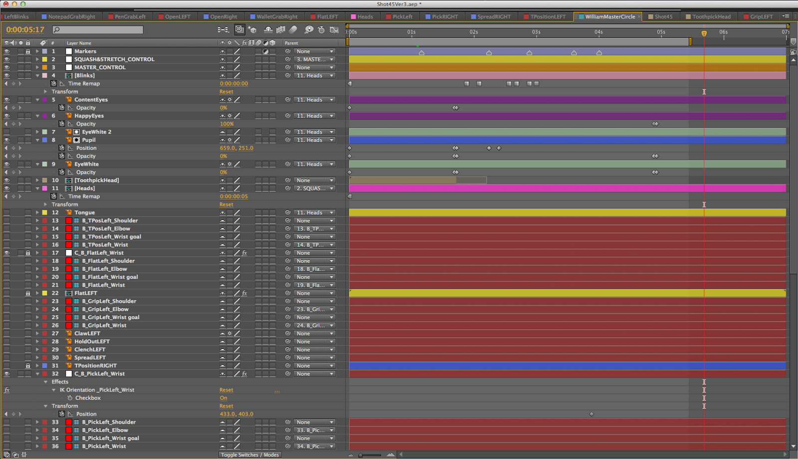
I used the free Duik plug in to make the arms and legs (in the below example the legs aren't rigged as Betty doesn't move, she slides in from the left off screen) IK which allowed more control over the movements, but restricted how much I could move the main body, especially rotated, (the 'MontageAssets' layer acts as the parent for most of the other layers as it is a central point in the character) the arm / hand pre-comps didn't move with the body rotation as the pins placed on them are literally pinned to their place in the comp. The only way the arm / hand pre-comps could be animated with the body was if they were animated separately as their own layer.

The screenshots below include all the layers including the hidden ones. These are the layers (control pins) from the Duik plug in and are hidden themselves)


WILLIAM


Pre-Comps


Heads


Mouths

Example file for shot 45, the most complicated rig I set up for William:


Side note:

I have created a burp mouth shape for William, however I don't think it'll be obvious what he will be doing when he burps because of the design of this asset. I am going to keep this for now, but may have to animate a mask to show him opening and closing his mouth too. I got the idea to use a mask instead from the animations seen in the link below.

Cartoonstock.com - Burp Animations

William the Waitress Costume Combinations:

Head and arm asset combinations


Fat Head and Fat Arms


Fat Head and Thin Arms


Square Head and Fat Arms


Square Head and Thin Arms

I decided to go for the last version of William as I feel making his head and arms fat, the only part of himself we actually see, is completely different to his state before the montage takes place. This would also confuse the audience a little so I decided to take it out and leave him in his square state.