Friday 29 November 2013

More Research - New York Manhattan - Street Layout and Directions

To get across my film is set in New York City during the late 50's, I've decided to research the lower Manhattan area more. I went back to my earlier research of New York City and thought more about my layout in conjunction with the geography of the city.

Original camera set up reference - research done during Week 2


I set up the camera reference above facing the subway line I have in my exterior background but after closer inspection of the map, I've found out the camera (as above) would see the buildings in front at an angle because New York City uses a grid-iron road system.


I decided to change the angle of the camera reference so it would fit in with my exterior floor plan I've got going for my film. Using the map, I've decided to set my diner on 9th Avenue, about half way along the dotted blue line in the screenshot above.

Going back to the set up of the exterior assets, I have decided to use the geography research I've done over this term so far and place two street signs in my T-Junction - 10th Avenue, West 57th Street and 9th Avenue, West 51st Street (blue circled above).

10th Ave. 57th St. is on the left of my diner and 9th Ave. 51st St. is on the right of my diner.


I also thought about the surrounding area of my diner, and the kind of shops that might have been in Lower Manhattan during the 1050's. The area was a typical housing and business area which fits my film location well since I have apartment buildings in the fore and mid ground of my scene as well as some shop exteriors, namely a barbers, car wash and market store.

Another piece of interesting visual research I found was a collection of video clips that were recorded during 1950's New York 

1950's New York City video recording

Exterior Scene Asset Redesigns

Before I began creating the actual assets for my film, I took a look through the designs for the assets in my exterior scene I did a few weeks back as well as the After Effects 3D scene test I did on Tuesday and decided that they weren't interesting enough to look at. I also knew that if I illustrated the rest of my assets in a similar simple design, my 3D scene won't look rich or vibrant like it should be. They also didn't have much detail but definitely had the zany style I am going for in my film. Here are the exterior assets I redesigned.


References


Thursday 28 November 2013

After Effects 3D Scene Set Up Practice

I've been practicing illustrating various assets for my exterior scene and importing them into After Effects to create a 3D scene that I can bring in cameras and animate certain shots for example the establishing shot which is a pan and track in.


I put each part of the apartment building on separate layers before going into After Effects. I made sure to "Release to Layers (Sequence)" before I went into After Effects and imported the ai. file. This is so the layers appear in After Effects as they do in Illustrator. 

I parented the different parts of the building to the main building shape so when I moved that particular piece to set it up in 3D space, everything parented to it would move with it too in all directions. 

Concept Art - The Party


For this particular piece I wanted to get across the feeling of joy and celebration in the diner. This shot is the beginning shot of the final scene and the resolution of the story which is the emotional high point of the story. By using strong bright contrasting colours for this scene, I think I've got across the impression of a party scene happening. 

Parties host many types of people getting together so I expanded on this thought and designed two sets of characters which are seen in the group of people in the middle of the frame. The middle two are the fun types who are enjoying themselves and the two on either side are the ones who aren't enjoying the party. 

Tuesday 26 November 2013

Maya Neon Sign Practice

Although I am now doing a full 2D film, I am still considering incorporating some CG elements into it. I am also going to develop these elements in my own time too.

Yesterday when walking home from the studio I noticed how bright and kind of magical the neon lights appeared on the Ritz Wetherspoons located on the High Street. The quite bitter temperature in Lincoln that evening seemed to make the lights more apparent and welcoming than usual, in my opinion. I took a photo on my phone to see how the colours and overall looks of the neon lights looked through a camera lens.


I also noticed how the light emitted from the neon lights fell on the ground and surrounding brick work on the building. I like how they highlighted the details on the bricks including the outlines of the shape of the building. This is something I'll have to think about when constructing my scene in After Effects. 

----------------------------------------------------------------------

Today I've been trying neon signs that represent objects using actual geometry instead of applying shaders to text like I did last week.

I decided to take one of the car design sketches I did over the weekend and make a 2D neon sign out of it.


Next I took this into Maya as an image plane and started making the geometry using the CV curve tool. I then edited the resulting shape by moving the Control Vertex's to line up with the image plane better.


Some parts of the sign are closed circuits so I had to select both the first and last point and turn on Snap to Points and then go to Edit -> Open/Close Curves to close the loops so when it came to extruding the curve using a NURBS Circle, there wouldn't be any gaps in the geometry created from the open CV curve.


Next I deleted the image plane, since I didn't need it anymore and began extruding the curve out to create geometry. To do this I had to select the NURBS Circle and then shift select a piece of curve. I then went to Surfaces -> Extrude settings and set the extrusion settings to "At path" for Result Position and "Component" at Pivot.


I then repeated this for each piece of curve. 


I noticed some imperfections in the geometry formed so I had to go back to the curve and make sure the path was closed.


Now that all the curves had been double checked for imperfections, I could reduce the thickness of the geometry by scaling down the NURBS Circle I used to extrude from.


I then had to scale down some pieces of the car so they didn't intersect the other pieces of geometry close to it. To do this I had to centre the pivot first. I also had to select a section of some Control Vertex's and scale and/or move them slightly to get as much a perfect shape of each piece of geometry so the whole car looked good.


Now that the geometry was completed, I could start setting up the neon shaders. To do this I used the Hypershader and made three Lamberts and named them "red", "white" and 'blue".

Incandescence

really bright red hue - 'glow' colour


Colour

lighter red - main colour of the shader


Increase Glow Intensity under Special Effects to around 0.15 to start with


Repeat for the other two lambert shaders


Finally I applied the shaders to the parts of the car and took a test render

?

The blue appeared darker than it should have so I went back to the shader and changed the incandescence of the "blue" Lambert to a lighter hue of blue.


I then took a Production Quality render using Mental Ray since that is what I might be using to render none signs out in the future.


After looking at the geometry closely I discovered more imperfections so I went back in and sorted them out. I didn't delete the NURBS curves behind the geometry so I could go back and edit them too.

The 50's Film Look

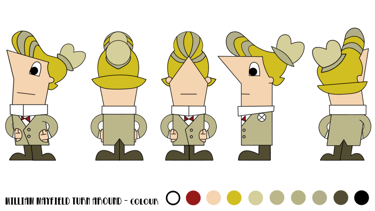
This afternoon I had a catch up conversation with Neil about my film and my progress. I showed him the animation test I did a few weeks back and he really liked the black and white look to William. I decided to see how my other character Betty will look in black and white and went back to my characters in Photoshop and placed a black and white adjustment layer on top of the existing colour turn around.


After experimenting with the colour levels of the adjustment layer I applied and found that reducing the red to make William's hair darker made him look more appealing and slightly more imposing in my mind. I experimented with Betty's colours too but I think the original one I did above works best for her character, both design and personality. 

Over the past couple of weeks especially I have found colour to be difficult to get right, both for characters and layout. I've struggled to get across the emotion the most but I think my colour script gets across the emotion ok.

I'm not too sure on the black and white version as it changes the mood of the story on its head - it's almost a horror at a glance! 


I wanted to see how the general look of my film might look so I did the same as above to my New York City concept.


This was a suggestion from Neil for my film aesthetic. Although it emphasises the 1950's style I am going for, it takes away the setting of my film being set on one of the most celebrated nights all over the world. Because my film is being put together in After Effects, I can apply a black and white adjustment layer to my film during post-production whereas if I illustrated all my assets in black and white, I can't do the opposite where I apply colour.

Car and Diner Design - Sketches


I want the diner to be the focus point of my exterior shots. The apartment buildings of either side of the diner as well as the two smaller buildings in the foreground and the three rows of building silhouettes in the background are composed of angular straight edges. This is why I have gone for a diner that's rounded and small in comparison to the surrounding buildings so it'll stand out more.

Disney Pixar's "UP" were a great inspiration for this concept. The use of contrasting colours; warm colours for Carl's house and cold blues and greys for the surrounding development sites have been very helpful in decided the colours for my diner and surrounding apartment buildings. I think that using pinks, yellows and reds for the diner, mainly the interior, will get across the idea of the diner being a warm, fun and friendly place.


Monday 25 November 2013

Pre-Production Research and Influences - Books

During the course of the Pre-Production module, I've found that renting art and design books from the Universities' Library have really helped for inspiration for my film as well as references to design and colours. 

One book I found particularly helpful was Amid Amidi's "Cartoon Modern: Style and Design in Fifties Animation" because of it's variety of design styles as well as information about animation during the 50's. I found the section on United Productions of America's (UPA) later work to be particularly inspiring. For example Jules Engel's "Mister Magoo" backgrounds have a lot of forced perspective in them which inspired me to go for a simplistic, straight edged style to my New York City design. Also the Lew Keller's concept art for John Hubley's "The Four Poster" also inspired me to think about using block shapes for the background buildings in my exterior shots.


Another book that I rented from the library also helped me to think more about character design. Mark Cotta Vaz's "The Art of The Incredibles" was particularly inspiring when it came to thinking about using as little lines as possible to create a simplistic and effective character designs. 

Sunday 24 November 2013

Improved Production Plan

Here is my finalised Production Plan. I changed it to match my change of mind of doing a 2D/CG to full 2D film. For some reason, Google Drive won't let me include all of the Excel document.

https://drive.google.com/file/d/0B0YBS3WUMMY9UGJiMnVkanhPT2c/edit?usp=sharing

3D Layers, Cameras and Lights in After Effects

Before I get stuck in illustrating the assets for my film, I wanted to see how 3D space works in After Effects so I know the constraints of using Illustrator and After Effects 3D space.

Illustrator file


Importing and set up in After Effects


Making the objects into 3D layers and adding a camera and spot light

I've enjoyed the process of illustrating and setting up the object in 3D space and am looking forward to starting my final exterior in After Effects.

Project Production PipeLine

Record Animation References - WIP

Exterior Assets - DONE

Matte Painting Backdops - WIP

Interior Assets - WIP

After Effects Scene Set Up - WIP

Lighting - N/A

Characters - WIP

Props - WIP

Asset Checks and Improvements - WIP

Rough Animation (Blocking) -

Animation -

Animation Checks -

VFX -

SPFX -

Compositing -

Sound -

Final changes and edits -

Rendering -

Important project update

On Thursday I took a step back from my project and realised the scope of it all. I started to get overwhelmed by it all and after much thought over the past few days I have decided to do a full 2D film instead of a 2D/CG film. The reason behind this is that I feel comfortable with the work load and although I've been testing different CG assets e.g. cell shading, chrome shaders and lighting, I'm not particularly enjoying the work. I don't want to start production where I'm unhappy with the work and the amount I need to do because it'll affect the quality of the work down the road. Another thing is that my intention for this project was to show my design style and animation skills using After Effects to create a short film. I'm happy with my progress in CG and have learn some new things and may return to the 2D/CG style further down the road in my career or free time. For now however, I want to stick to Illustrator and After Effects because I am really enjoying developing my skills in those softwares and seeing my characters come to life.

I am going to go back to the piece of inspiration that really got me excited to try Illustrator and After effects together to create a short film.

"Create a Cartoon in After Effects" - Tutorial Album on Vimeo

This week is the end of my first week of production schedule and I have finished all the pre-production for my film and recored some animation references. My final task of the week is to see how my characters look in my film.

I used my diner interior concept and placed my characters on top. I have decided through experimentation that it works best when the layout has just colour fill and the characters have lines. They stand out more and overall look like they belong in the scene.


Wednesday 20 November 2013

Research & Development - Neon Signs in Maya

My film will contain several neon signs, some outside and some inside the diner. I've been researching how neon lights work in different weather conditions and have found that they don't really appear any different whether the conditions are warm, cold, wet or foggy.

My exterior shots (the very first and the very last shots) take place outside in New York City during mid winter. The average temperature of New York is around 6 to -3 oC during December and January.


I decided to have a go at testing Maya's paint effects tool to create some neon lights of my own.


To do these, I created some text as curves and attached a neonBlue paint effect using the brush tool to the curves.

I also attempted to apply Lamberts to the geometry and increase the glow intensity to see how it looked but I don't think it captured the same magic about them.

Character Design - Character Turn Arounds in Colour

The characters for the production stage won't be drawn or coloured in Photoshop. I will individually draw every asset (i.e. body part) on separate layers for both characters in Illustrator and then I will take them into After Effects to animate them individually.